Functional and behaviors specs template v1.0
December 19
Disclaimer:
This document is a template which purpose is to present the structure and tone of voice/semantic specifications should follow.
The information detailed in this file are not relevant, and the different parts are not related to each other. It is made from different specs stitched together.
Do not attempt to build what is written below
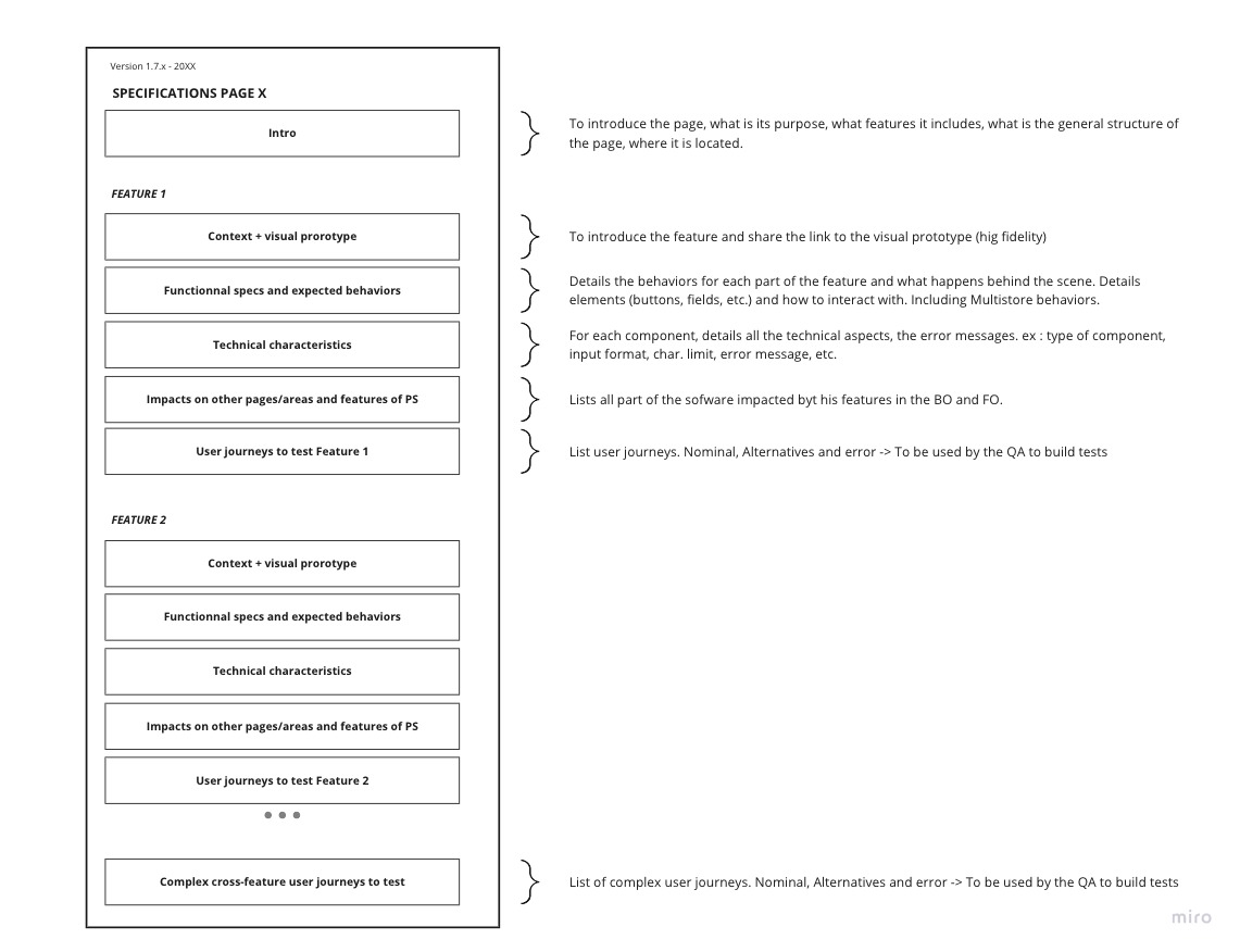
Structure
This template presents how to write a page Intro, and features’s Context, functional specs and behaviors for features.
It corresponds to the Page’s “Intro” block and to the features' “Context+visual prototype”, “functionnal specs and expected behaviors” in the schema below.
  The following specs is about the Order View page.
  To see the page in the software, go to Orders > click on an order.
Specifications for the order view page for 1.7.7 - 2019
INTRO
User Story:
As a merchant, I need to be able to manage all my orders online and manual one.
As merchant managing order is essential for my e-commerce, I need to be able to:
- Check the order’s product to prepare it
- Manage the order’s progress,
- Edit the customer information or send him/her messages,
- To print his invoice,
- Handle payment methods,
- To follow my shipping through activities,
- Returns and refunds
WHY
The Add order page (Orders > Orders > View button) is expected to be migrated to Symfony for the 1.7.7 version and will be reworked for better user experience.
Some new specifications for the new design are in progress but to avoid any features regressions. We need to specify the whole behaviour of this page to make it easier to compare the new scenario and avoid any new bugs and regressions.
WHAT
Thus, this project aims at specifying the new behaviours for every scenario a merchant could be dealing with the order management. This specification should specifically define :
- Order (order status, invoices, cancellation)
- Customer (customer card and addresses)
- Payment
- Messages
- Refund
- Product & voucher
SPECIFICATIONS
Orders > Orders > View order
The user access to the order view page by either clicking on the order’s row or the view button.
Generic page operation - Order view
On the header, we have the order’s reference, customer’s name, total price in black background, the date and the hour.
FEATURE
I. Action panel
Bellow the panel’s header, we have all the order’s action button:
- Update the order status
- Print order button
- View invoice show button
- View delivery slip button
- Partial Refund button
- Standard Refund button
- Return products button
- Cancel products button
- Cancel button
- Update the order status
The current status is displayed by default on the droplist. It can be changed by selecting the new order’s status from the droplist after validating the confirmation button.
- Print order button
Opens the Print page of the browser with the order’s content.
- View invoice show
If the current or new order status as the generation of the invoice activated, the button is shown or the user generates it manually.
When the user clicks on the button, it downloads the invoice.
- View delivery slip
If the current or new order status as the generation of the delivery slip then the button to download the delivery slip is shown.
- Partial refund button
If the current or new order status of order considered as paid then the button is shown. After clicking on the button, then the product table will take the full width of the page. The user can edit the refund amount by product and also the shipping cost. He must select the quantity of the product concerned for the refunded and then write refund amount chosen by product rows. The maximum refundable amount is written bellow all the amount input in tax included.
By default, the quantity input has 0 prefilled. To validate a partial refund, the user must must as selected minimun 1 quantity.
Before the validating a partial refund, the user can choose to re-stock or generate a voucher by checking the checkboxes.
When the status “Refunded” is applied to the order, the refund amount is deducted to the total spended by the customer since registration and the number of valid orders placed decreases by 1.
After the validation a partial refund, a new column is added with quantity previously selected and the amount entered.
- Cancel products button
The cancel button only is shown by default on the creation of an order. The button disappears when the order is considered as paid
When pressing the button, the product list takes the full with of the page and the column cancel is added. On the column cancel, a checkbox and quantity input is displayed. Checking the checkbox will prefill the quantity input with the quantity of the product ordered. The quantity input can still be editable.
Pressing the button cancel will reduce the quantity of the products selected if there still some left otherwise it deletes the product from the list.

To cancel products at least one of the product must be selected.
When all the products are cancelled, the status automatically changes for “Canceled”.
- Standard products button
Standard refund only appears when the merchandise returns are activated and the order is considered as paid and disappears when the order is considered as shipped.
When the user presses the button a column “Refund” is added with a checkbox and the input quantity.
A quantity must be selected to refund a product.
Before refunding the products, the user can choose to generate a credit slip and/or voucher. See if you can add the button restock

When all the products are refunded order status change to Refunded. A product can’t be refund multiple times.
After refunding, it shows on a column “Refunded”, the quantity and the price of the refund per products.

- Return products button
Return product only appears when the merchandise returns are activated and the order is considered as paid and disappears when the order is considered as shipped.
When the user presses the button a column “Refund” is added with a checkbox and the input quantity.
A quantity must be selected to refund a product. A product can be return if it has been re-stock before by another process has standard, cancel or partial refund button. A product can’t be refund multiple times.
Before refunding the products, the user can choose to generate a credit slip and/or voucher or/and re-stock.

After returning the products, it shows on a column “Return” and “Refund” with the return quantity and the price of the refund per products if a generated slip was checked in the option.

FEATURE
II. Customer panel
The customer panel displayed on the left of the product list has the customer’s title, name, last name and customer reference. To see the full customer description, you can click on View full details that redirect to his customer page on another page.
Customer panel is divided into 3 parts:
- Customer card regrouping the customer’s information
- Shipping and Invoice address
- Private customer note
Customer card displays :
- the email on a “mailto” link
- date of the account registered
- valid orders placed on a black background
- total spend since registration on a black background.
Shipping and Invoice address
Each address has a button to update or change it. The button opens a list to select the user wants to edit or update it.
Edit/Change adresse behaviours
The edit address redirects to the edit address page of the selected address. After saving any edit of the fields of the address form, the user is redirected on the order that he was editing in the first place.
And change address opens the popin that allows the user to choose the new address form a droplist.
Private customer note is closed by default when it is empty and open bu default when filled. To add a note when it is empty, the user has to click on the + button and has to press on the save button to save it.
FEATURE
III. Messages panel
Bellow the customer panel, you have the messages panel. The total of the exchanged messages is displayed next to the panel’s title.
Only the 4 last messages private or public are displayed showing the sender’s name, delivery’s date and the content’s message. The private message is displayed with a dark background and a specific icon for the sender pic.
Bellow the messages displayed, the user can choose a standard message to send. all predefined messages of the order messages page are available in a droplist to select the message to prefill the message input text. By default, there is no prefilled message so the droplist shows “-”. The link named “configure predefined messages ->" below the droplist is available to open on a new browser’s tab the order messages page to access to the predefined messages.
After selecting the droplist selection, the prefilled text is still editable.
A checkbox is available to choose to write a private message hidden from the customer.
Customizing the prefilled message, writing the message from scratch or using the prefilled message, the user sends it by clicking on Send message. It sends the email and adds the message on the front-office on the message section of the order historic page and an email as presented on the screenshots below.
To see all the past messages, there is the possibility to click on the right of the send message button on View full conversation to open on a popup.
FEATURE
IV. Product panel
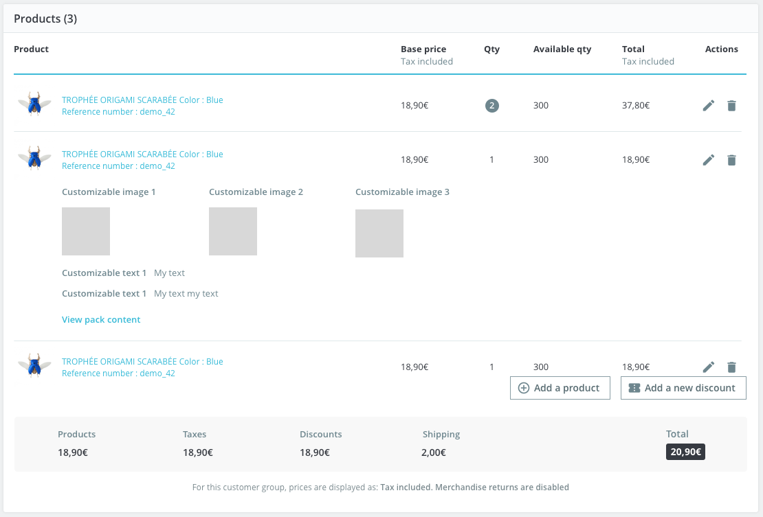
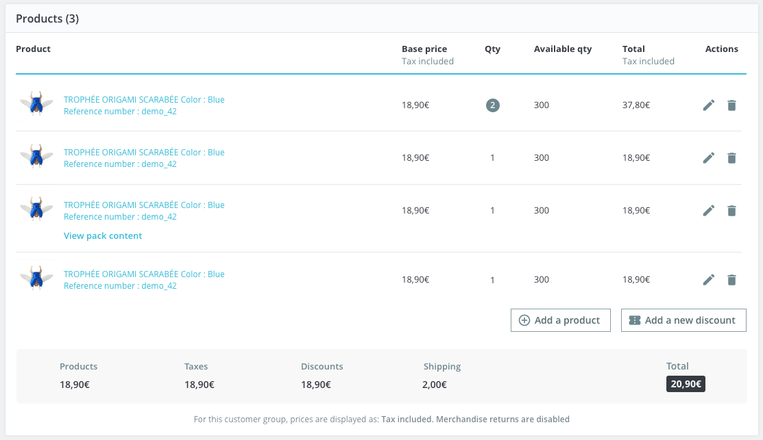
Bellow the action button on the right, the product panel displays the order’s products into the table list showing:
- the product’s image,
- product name (composed of the name, combination name and reference),
- stock location, if one of the product has one
- base price with tax included,
- quantity,
- available quantity,
- total with tax included,
- and two action buttons edit and delete.
When the product has customization, a row is added below the product with the labels of the customization and the content from the customer (image or text). When the number of images exceeds the size of the toe, they go to the next line.
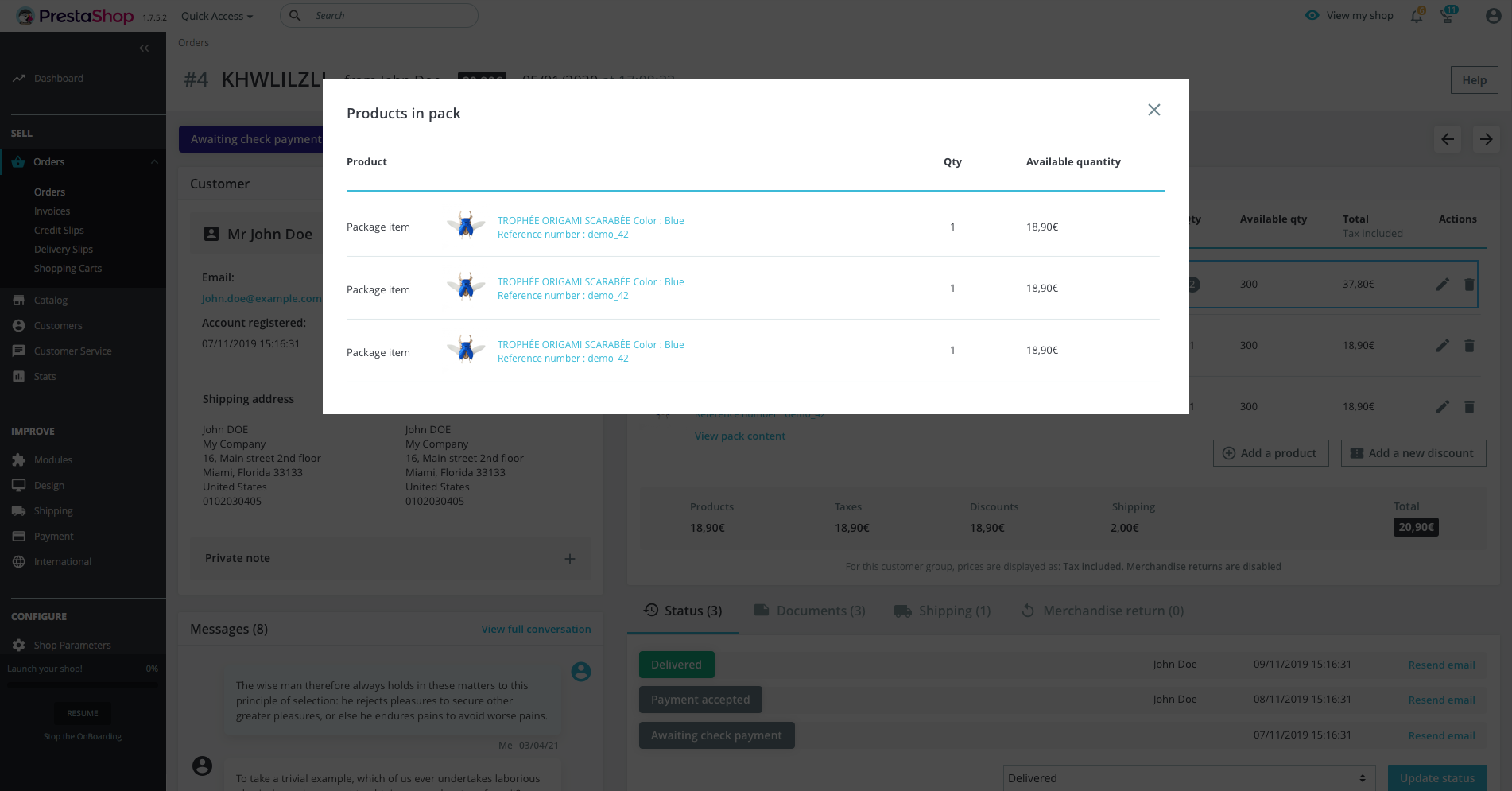
popin displaying the products from the pack
When the product is a pack of products, a link is added bellow the product name to show all the product in an popin.
By pressing on the link “View pack content”, it opens the products from the pack in a popin:
Popin displaying the products from the pack
The pagination of the list starts when there are more than 8 products The stock location column is hidden only when none of the products has a stock location only on the website. The column is only displayed at the corresponding pagination. If only a product on page 2 of the list has a stock location then the stock location column appears on page 2 and hidden in the other pages.
The quantity is coloured in a dark grey background if it is 2 or higher.
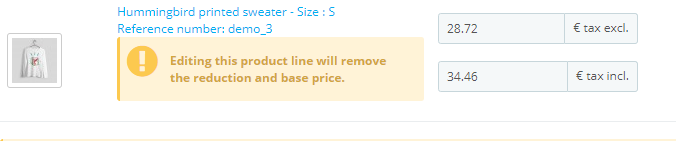
The edit button allows the user to edit the excluded and included base price and quantity. If the user edit an amount in the input without taxe it will insert the amount plus the product taxes in the input with taxe automatically. And vice versa, if the user edit an amount in the input with taxe it will insert the amount less the product taxes in the input without taxe.
The merchant is warned if he edits the price of product with a specific price or an catalog price rule.
While editing the quantity, the total updates itself to let the user know the impact price that it will have. The Update button to save the modification or Cancel button to drop it.
The Delete button removes the product for the list.
A confirmation pop-up appears after clicking on the Update button or the Delete button.
At the end of the table list, there are 2 buttons:
- Add a product: add a row on the table list with a search bar on the product name column. If the desired product has combinations, a drop list can appear below the search bar. After selecting the product, the user can edit if needed the base price tax excluded or tax included and the quantity. The quantity input is an input type number that decreases the available quantity when the user increases the quantity. If the quantity selected is higher than the stocks, available quantity label becomes red. The product is added in the product table and to the order after pressing on the add button if the there is enough quantity otherwise a warning error is shown (except if the stock parameter allows to sell without stocks).
Add a product old design but the same behaviours
- Add a new discount: opens a popin to create your new voucher between the Pourcentage, the Amount (taxes included) and Free shipping type.
The vouchers will be added on the table list displaying the discount name, value and the delete button on the top of the summary order. The new discount created is added with the status deactivated on cart rule page with zero quantity.
If the order status is considered as paid, either on adding a product or adding a discount adding, the user as to specify on which generated invoices it will be applied.
The bottom of the product panel resume in a list all the order:
- Products total with taxes excluded
- Total shipping
- Discount if there is any cart rule applied
- Wrapping if there is wrapping option in the order
- Taxes
- Total in black background
Below the totals, a warning message is displayed to warn the user that for this customer group, prices are displayed as HT or for this customer group, prices are displayed as TTC depending on the customer group setting and also that returns are disabled. when the merchandise return is disabled on the merchandise returns page.
FEATURE
V. Tabs panel
All the tabs are located in the same panel bellow the products list.
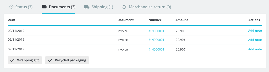
The label “Wrapping gift” and “Recycled packaging” are only shown when the feature are present in the order. It must be shown on all the tabs.
- Status tab
The table list of the latest order status is displayed composed:
- The status with associated coloured
- date and hour
- The editor
- Button to resend the email to the customer
On the bottom, a drop list of all the status available is shown to update the current status through the button Update Status next to it. Updating the order status will trigger all the actions set by the order status.
- Documents tab
The document tab regrouped all the document as invoices and delivery slips in a table. The table displays the date, document type, reference and the amount. The reference is a clickable link to download the document.
Each table’s rows as 2 possible button actions:
- Enter payment: it redirects to the payment panel to fill the transaction with the invoice preselected.
- Add note/Edit note: it displays a text input that can be saved or cancel. The saved note will be integrated into the related document.
If there is no document, a button is available to generate an invoice with all the information saved so far in the order.
- Shipping tab
The carrier table shows the date, the carrier, the weight, the shipping cost, the tracking number and edit button.
The edit shipping button on each row can edit the information in a popin. You can edit the text input the tracking number and in the drop list the carrier method.
- Merchandising returns tab
The merchandise return tab lists the date, the tracking number, the type, Carrier (which is the return status) and the quantity. When the merchandise return is disabled the tab displayed: “no merchandise returned yet”.
- Payment panel
The payment section displays all the transactions made in the order from the payment’s module or the manual inputs.
The table shows the date and hours, the payment method, the transaction ID, the amount with the currency and the button detail.
To fill a payment transaction, the user has to select the date, one payment method from a droplist, the amount and currency then press the add button. The amount can be a positive or negative value.
A red warning is shown if the filled amount is inferior or superior of the order’s total comparing the total of the transactions and order’s total.
After adding, the user can display all the details of the transaction by pressing the Detail button. It will show below the arrow the number, brand, expiration date and owner of the credit card for any payment module.
If the order’s status is considered as paid then before adding a transaction the user has to specify in which generated invoices from a droplist it will be added.
When the status accepted (waiting for payment) you can change the currency of the order with a drop list.